YU HENG TEA Brand Identity & Packaging
有恆焙茶

CREDIT
Design Company ︎ Onion Design Associates
Creative Direction ︎ Andrew Wong, Janett Wang
Design ︎ Yang Fong MingCreative Direction ︎ Andrew Wong, Janett Wang
Client ︎ Yu Heng Tea
PRESS
TOPAWARDS ASIA
BRIEF
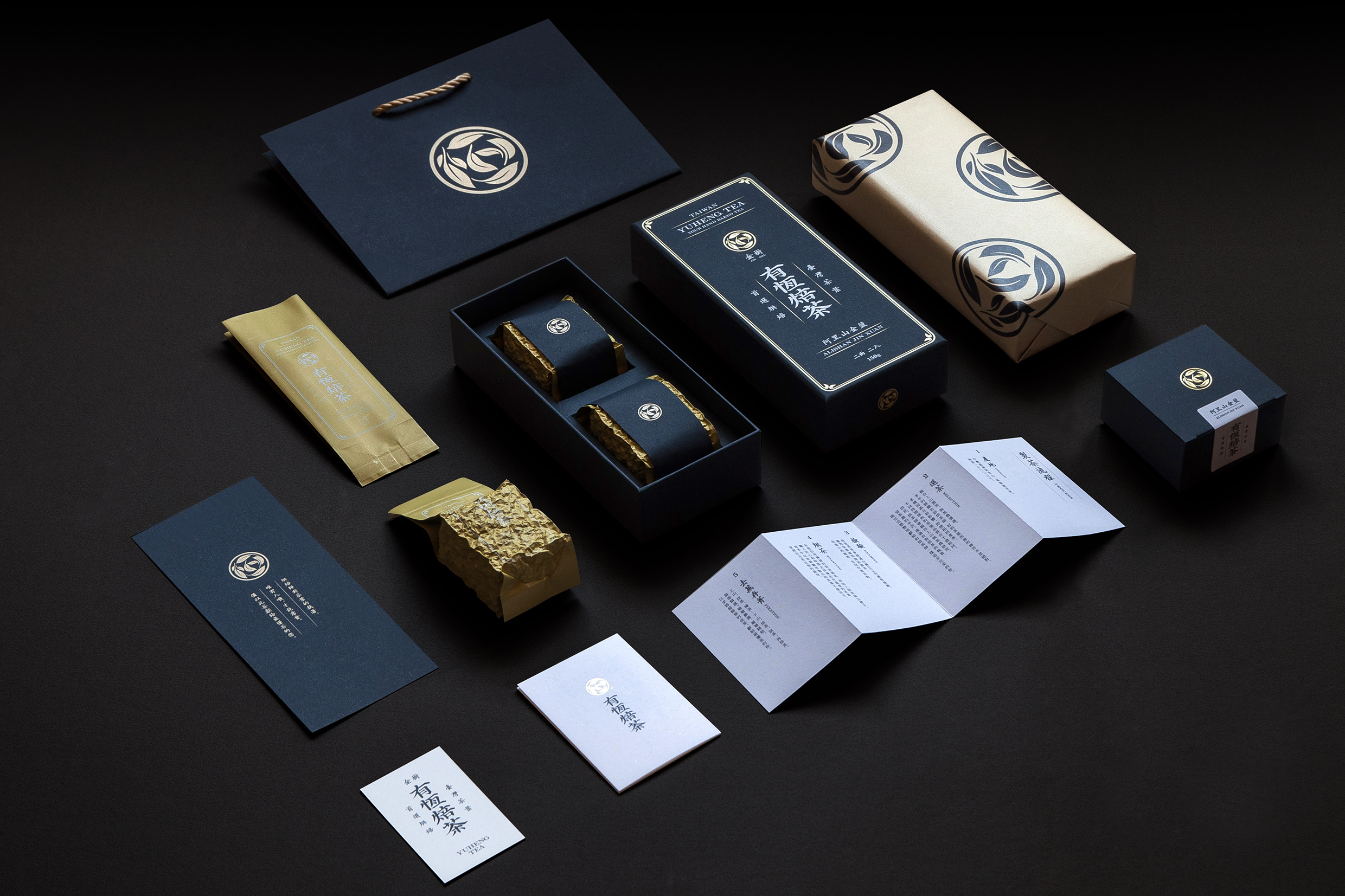
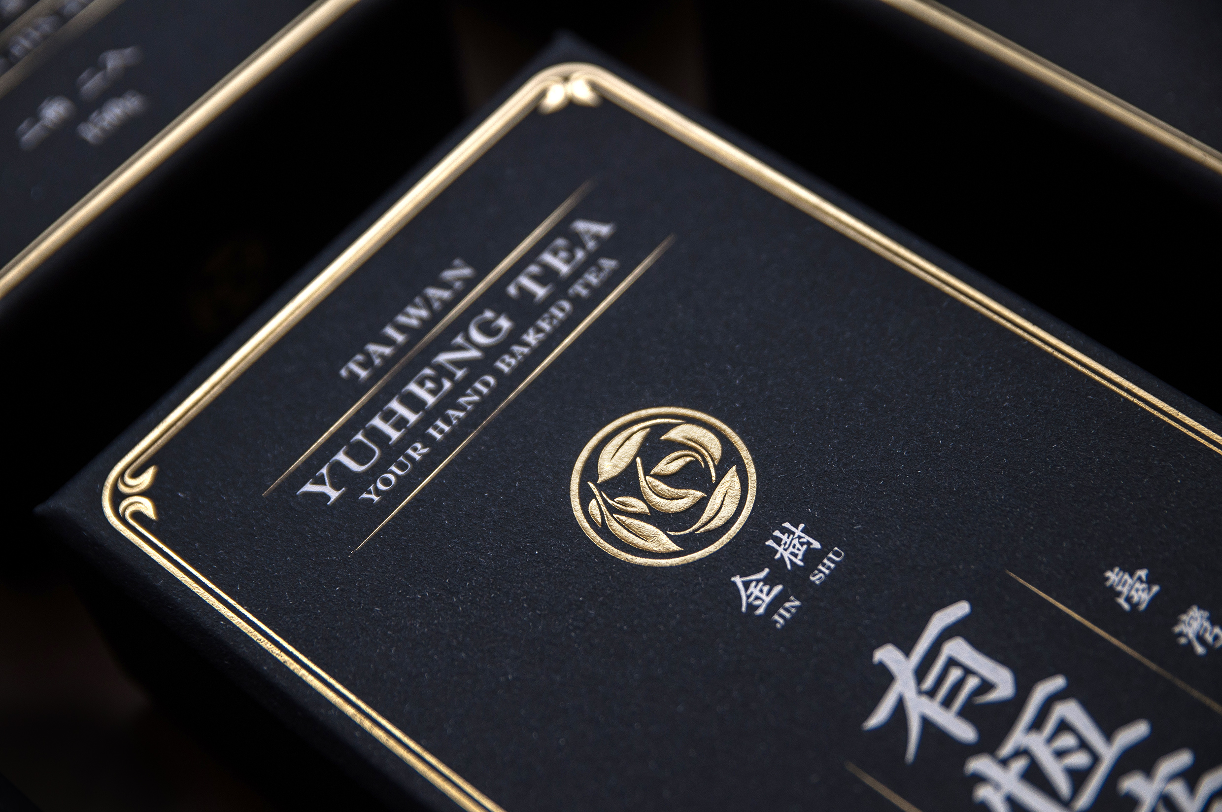
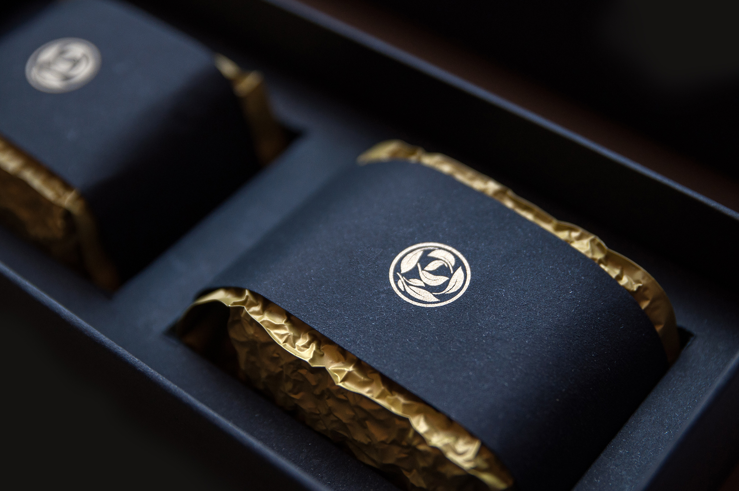
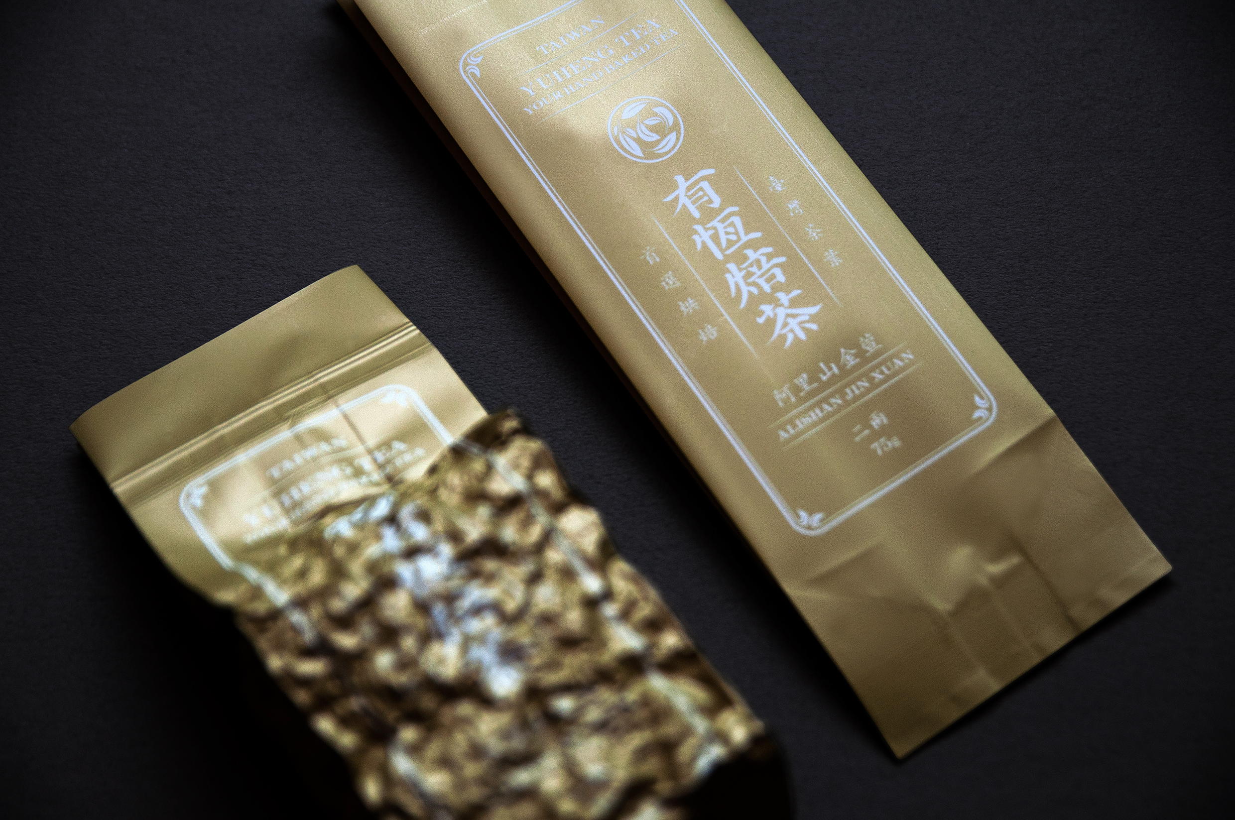
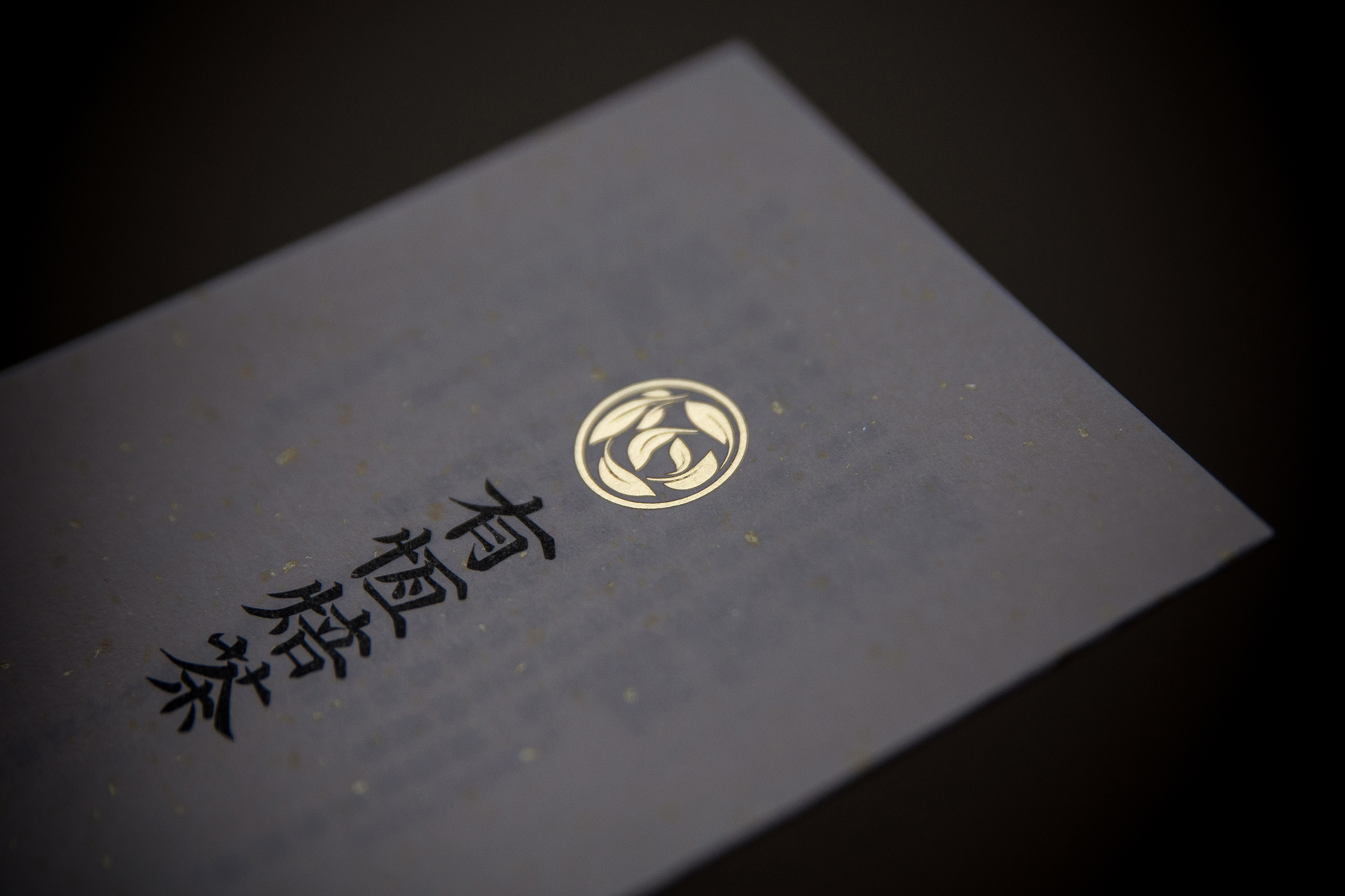
有恆焙茶起緣於業主的父親,一位對茶葉有獨特見解、敏銳、挑惕與堅持的達人,這些態度不僅面向茶葉,也落實於自身的生活上:簡樸、純粹、回歸單一、總穿著一樣的衣服、堅守一樣的固定作息 (包含起床、用餐、運動、喝茶.....),但於他興趣所在如茶葉,卻是熱情的無限付出。回饋於此的的心情與態度,我們仔細推敲了所有設計的面向,自初始的identity發展開始、到所有元素的搭配、視覺重量與負擔的規劃、選紙、印刷與加工表現,期望能展現與其心情相當的外在。identity取自「恆」一字造型、與如於茶湯之中的茶姿、與茶葉製程中的一環三者結合。有所選擇的細膩、精緻、準確、堅持與工匠精神、還有對所認同價值觀展露無比的熱切之心。
Yu Heng Tea, a small-scale family own tea producer in Taiwan. The logo design is based on the Chinese character "恆' taken from their brand name "有恆焙茶". It is also a graphical representation of the tea leaves inside a cup as well as tea leaves lying on a bamboo tray during the withering process.
AWARDS
2017 ︎ Golden Pin Design Award